
Over at Bill's pad, The Kind of Face You Hate, a post about the great Val Lewton segued into a discussion as to the merits of Godard's more 'minimalist' black and white films versus his more 'formal' color pictures. Since I've been inundated with finals and projects and the like, my time to waste with my fellow movie nerds (I mean that affectionately) has been cut down severely, and I missed out on a fascinating discussion with my pals Bill, Ed, and Greg about one of my personal favorites (it was already several posts ago at Bill's blog, damn you guys and your commitment to updating!). So consider this my own bumbling contribution to that particular thread. I'll look at five of Godard's first six seven color features, and try to explain why his use of color has so impacted the way I watch movies.
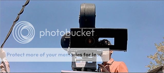
I don't know if a film maker has ever taught me more about screen color and its implications than Jean-Luc Godard. This is, after all, the film maker who understood that sex, communism, and blood all register the same to the eye--- on the screen, it's red. From his debut film Breathless, his agenda has been highly formalist (though certainly not strictly formalist), and his color films were a natural continuation of his rumination on the psychological and cultural powers of cinema. The above pictured moment from Contempt, his first film in Cinemascope, typifies in many ways the self-reflective way Godard treated the medium. He turns the camera on the audience, inviting us to see the illusory power of cinema through a looking glass.
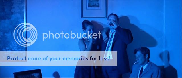
Take a look at the scene from Contempt that introduces the married couple played by Michael Piccoli and Brigitte Bardot. The legend is that Godard was forced to shoot a nude scene with Bardot by the studio, because they wanted to return their investment on their investment in Bardot, who was seen as a sex symbol of the time (though that's truly something that's lost on me). His use of color speaks volume about their relationship from the moment the movie begins.

We would normally associate a dark shade of red with intimacy and passion, and Godard subversively uses this effect to highlight their emotional distance from each other. He gives us nudity without eroticism (and no, this whole post is not just an excuse to show Bardot's ass , thankyouverymuch).

And, in an instant, what little illusion of intimacy there was is shattered, with a return to 'natural' lighting. If it wasn't already, the type of relationship these two characters have is already very clearly spelled out.

Then, he switches to a blue hue to highlight the coldness of their relationship. Again, the color usage has an instant psychological association and its the colors that convey the ideas, both narrative and formal, of the scene.

-Fritz Lang in Contempt
So, moving on to Godard's second color feature Pierrot le Fou, the way he treats cinema as a big-screen canvas comes even more clearly into focus.

In the beginning of the film, Godard wants to give us an impression of how Ferdinand/Pierrot's nice, quiet home life is suffocating in order to align our sympathies with the little road trip that Ferdinand is about to take with Anna Karina. Notice the way the colors the little girl is wearing matches the colors of the bathroom. A little detail like that gives us the impression of how uniform his life is and how Ferdinand's existence is defined by routine.
When he goes to a party early in the film, Godard uses colors to seduce us into the nightlife--- we've escaped the tranquility of his home-life, and gone into the enticing world of drinks, celebrities, and sex. Again, the color contrast is what defines this narrative thread. Godard wants us to sympathize with the with Ferdinand's gravitation towards a new life of lust, danger, and adventure.
When he goes to a party early in the film, Godard uses colors to seduce us into the nightlife--- we've escaped the tranquility of his home-life, and gone into the enticing world of drinks, celebrities, and sex. Again, the color contrast is what defines this narrative thread. Godard wants us to sympathize with the with Ferdinand's gravitation towards a new life of lust, danger, and adventure.


Later on in the film, as Karina is attempting to entice Ferdinand to join him, the use of light and color is essential to fleshing out the psychological state of the two main characters. As they drive discussing their plans, flashing , blurred light blinds these characters to reason. It's an incredibly romantic, visually extravagant scene--- among my favorite moments in Godard's filmography (that I've seen).


At the end of the film, Ferdinand has reached the end of this rope and has gone somewhat insane (skip the next image and paragraph if you don't want Pierrot le Fou spoiled for you).

He's a little upset, as you can see... you might even say he's feeling blue! (bwahahaha) Godard literalizes the concept of 'being blue' visually, having his character paint his face blue to externalize his internal feelings of suffering. It's a stroke that is simultaneously ironic, tragic, and hilarious.
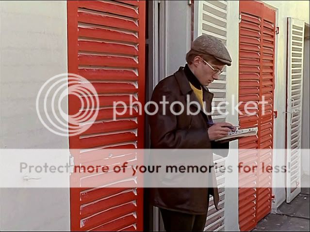
The next feature I'll be looking at, Made in U.S.A., is an effective bridge between the more playful, genre driven style of Pierrot le Fou and the more politically driven films I'll be taking a look at a little later on--- La Chinoise and Weekend (which is not to imply in any way that Pierrot le Fou is apolitical--- just less politically charged than the next three).

An early sequence has the main couple discussing the woman's sexual experience in a manage-a-trois. Godard holds the camera statically and keeps them in silhouette for what feels like an agonizingly long period of time, and the lack of clearly-defined colors here is as important as the abundance of it in his previous features. Keeping them in the shadows allows us to focus on the grotesqueness of what is being described, and this is in keeping with the film's modus operandi, making us uncomfortable in our own skin.

This is certainly when Godard became more of a blatnat polemicist, and I think the lack of an extravagant color-palette is part of what is touted as his stylistic 'return to zero'. Also, Godard is capturing the French country side in this movie, and I think he wants human beings to be just another part of that expansive landscape--- perhaps even an unnatural part. So the use of color is still there and still vital, it's just used to express a different sect of narrative ideas.


So, to me, his use of color is a large part of Godard's appeal--- he was one of the first film makers to show me what the power of carefully thought out and arranged color elements within a frame--- the ideas they can express on the narrative, formal, and even political level. It's the painterly aspect of cinema that so few artists have embraced quite as blatantly as Godard did. I don't know if his black and white films would qualify as more minimalist in tone--- La Chinoise and Weekend are stylistically less flamboyant than a film like Breathless, which announces from its opening frame that it's going to play with genre and form in a very blatant way. La Chinoise and Weekend are actually more minimalist in tone than some of his earlier black and white pictures--- establishing simple visual motifs and then mixing them up to further the motions of character and plot along. But the intrinsic appeal of Godard to me is that visual sensibility--- the way he uses colors and their psychological association to express his core narrative.
The next feature I'll be looking at, Made in U.S.A., is an effective bridge between the more playful, genre driven style of Pierrot le Fou and the more politically driven films I'll be taking a look at a little later on--- La Chinoise and Weekend (which is not to imply in any way that Pierrot le Fou is apolitical--- just less politically charged than the next three).
"It's like being in a Disney film with Humphrey Bogart", Anna Karina's character Paula Nelson says amidst the mad-cap absurdity of Made in U.SA., and that more or less encapsulates the formal and genre rumination Godard was attempting with this film. He tests our dependence on genre familiarity by giving us the most bizarre kind of mash-up imaginable; combining the eye poppingly-colorful and extravagant world of a Disney picture with the inward melancholy of film noir.
I tend to use the word 'test' in relation to Godard at all, and I don't mean to give the impression that he's strictly academic. His love of genre is always apparent, but the genre conventions are often a mask for queries into the nature of art. He breaks cinema down to its essentials--- to image and sound. There's a key sequence in Made in U.S.A. when he removes the soundtrack completely and we're just left with images--- which is actually very reminiscent of the "Meet the Soundtrack" segment of Fantasia--- where the artifice aspect is flaunted and used to investigate the physiological way images and sound affect us.
And Made in U.S.A. is just a colorful blast of a film, an absolute feast for the eyes. Hell, Karina's dress is more colorful than most other entire movies. Again, Godard's use of color here is painterly and eye-popping.


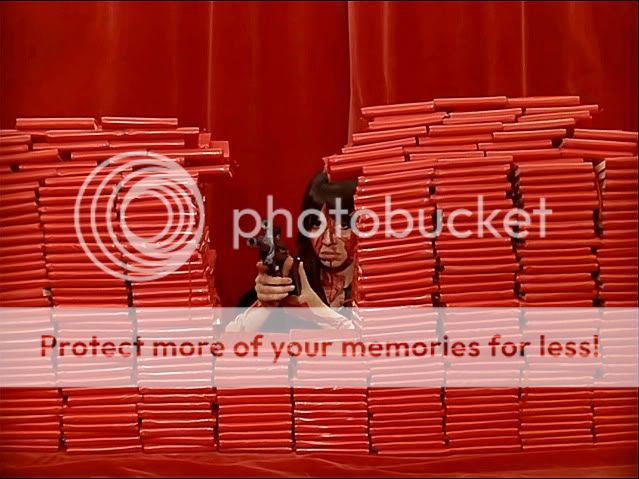
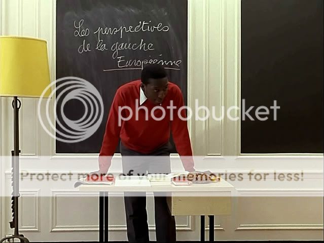
Of all the features I've discussed, color probably plays the most important role in the politically charged La Chinoise, a film that simultaneously documents and critiques leftist politics. La Chinoise stands as a fascinating time-capsule of the atmosphere that led to the 1698 student revolts, though the movie is in no way a call to arms. Rather, because Godard strikes me as the sort of person who doesn't want to agree with anyone about anything ever, he is critical of the drone-like way youth-culture is indoctrinated to the ideas of communism (or any philosophy) , how they simply go along with the parlance of their times rather than truthfully analyzing the philosophy itself--- they regurgitate the ideas they read in their endless stacks of red books, but they don't necessarily take the ideals to heart, much less think seriously about them. Are they even aware of what they're endorsing?
Naturally red plays an important factor in the movie, and Godard toys with the way we associate red with communism throughout the picture (there's hardly a frame that doesn't contain some element of red), and this is perhaps when his use of color most clearly plays a role in the narrative syntax because they are a large part of what convey the film's political ideas. "We should replace vague words with clear images", text at the beginning of the film says, and Godard's use of color is what illuminates the ultimate socio-political meaning of the images. His images are truly worth a thousand words.

Moving on to the final feature I'm going to discuss today, Weekend, Godard's bright, high contrast use of colors that I've been discussing here is replaced with a more saturated color tonality--- perhaps Godard turning away from what he called film's bourgeoisie history. But this doesn't mean that Godard's color minimalism with Weekend is any less vital to the general tone of the film than his previous, more colorful films.
I tend to use the word 'test' in relation to Godard at all, and I don't mean to give the impression that he's strictly academic. His love of genre is always apparent, but the genre conventions are often a mask for queries into the nature of art. He breaks cinema down to its essentials--- to image and sound. There's a key sequence in Made in U.S.A. when he removes the soundtrack completely and we're just left with images--- which is actually very reminiscent of the "Meet the Soundtrack" segment of Fantasia--- where the artifice aspect is flaunted and used to investigate the physiological way images and sound affect us.
And Made in U.S.A. is just a colorful blast of a film, an absolute feast for the eyes. Hell, Karina's dress is more colorful than most other entire movies. Again, Godard's use of color here is painterly and eye-popping.
Of all the features I've discussed, color probably plays the most important role in the politically charged La Chinoise, a film that simultaneously documents and critiques leftist politics. La Chinoise stands as a fascinating time-capsule of the atmosphere that led to the 1698 student revolts, though the movie is in no way a call to arms. Rather, because Godard strikes me as the sort of person who doesn't want to agree with anyone about anything ever, he is critical of the drone-like way youth-culture is indoctrinated to the ideas of communism (or any philosophy) , how they simply go along with the parlance of their times rather than truthfully analyzing the philosophy itself--- they regurgitate the ideas they read in their endless stacks of red books, but they don't necessarily take the ideals to heart, much less think seriously about them. Are they even aware of what they're endorsing?
Naturally red plays an important factor in the movie, and Godard toys with the way we associate red with communism throughout the picture (there's hardly a frame that doesn't contain some element of red), and this is perhaps when his use of color most clearly plays a role in the narrative syntax because they are a large part of what convey the film's political ideas. "We should replace vague words with clear images", text at the beginning of the film says, and Godard's use of color is what illuminates the ultimate socio-political meaning of the images. His images are truly worth a thousand words.
Moving on to the final feature I'm going to discuss today, Weekend, Godard's bright, high contrast use of colors that I've been discussing here is replaced with a more saturated color tonality--- perhaps Godard turning away from what he called film's bourgeoisie history. But this doesn't mean that Godard's color minimalism with Weekend is any less vital to the general tone of the film than his previous, more colorful films.
This is certainly when Godard became more of a blatnat polemicist, and I think the lack of an extravagant color-palette is part of what is touted as his stylistic 'return to zero'. Also, Godard is capturing the French country side in this movie, and I think he wants human beings to be just another part of that expansive landscape--- perhaps even an unnatural part. So the use of color is still there and still vital, it's just used to express a different sect of narrative ideas.
So, to me, his use of color is a large part of Godard's appeal--- he was one of the first film makers to show me what the power of carefully thought out and arranged color elements within a frame--- the ideas they can express on the narrative, formal, and even political level. It's the painterly aspect of cinema that so few artists have embraced quite as blatantly as Godard did. I don't know if his black and white films would qualify as more minimalist in tone--- La Chinoise and Weekend are stylistically less flamboyant than a film like Breathless, which announces from its opening frame that it's going to play with genre and form in a very blatant way. La Chinoise and Weekend are actually more minimalist in tone than some of his earlier black and white pictures--- establishing simple visual motifs and then mixing them up to further the motions of character and plot along. But the intrinsic appeal of Godard to me is that visual sensibility--- the way he uses colors and their psychological association to express his core narrative.